BRAND NEW BLOG: Launched December 2010.
Keep an eye on this blog by clicking 'follow' above or follow via Twitter, below right...
Truly time-poor? Key trends are written in BOLD!

Monday, 27 August 2012

Colours: Neutrals with Pastels. Some inspiring combinations spotted today...

Picture copyright of Kate Jacobs

Picture copyright of Kate Jacobs


I love boot fairs and have just been to one that has always served me well in the past. But not today. I'm not really interested in many things made after about 1985, with my (current) golden eras being the 1930s, 1940s and 1970s. Inevitably, less and less of this stuff is materialising at boot fairs. Today's fair was full of 1990s rubbish. It got me wondering if that's what my young daughters will be delightedly bringing home one day but, for me, it was singularly lacking in inspiration. I did see a couple of colour combinations that got me going. This tin of buttons on a stall full of boxes of colour-coded buttons (itself a treat!). Creamy, amber-y neutrals mixed with intense pastel shades; pea green, sky blue, butter yellow, salmon pink. Then this deflated dinghy! Dark, bluish-grey with another butter yellow and 'Germolene' pink.

In both cases, the neutrals - whether cool or warm in tone - are nice foils for the cheerful creamy pastels.


Thursday, 23 August 2012

Ferns: a growing trend...?

Fern plate. Picture courtesy of Ben Pentreath

I'm very into ferns at the moment. It started in the garden where I've been planting hart's tongue ferns. I've also found an old glass terrarium to plant up with maidenhair ferns and mosses for a bit of greenery indoors during the winter. Meanwhile, a few ferns have caught my eye in the interiors realm - see pictures. I hope that they're a growing trend. 
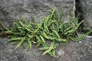
Ferns are not showy, but their fractal-like intricacy rewards close inspection. I love their lush, almost emerald green colouring. They make me think of sunlight filtered through green leaves into cool, shady spots.  I recently spent time on Dartmoor in Devon, and loved seeing delicate little ferns poking out of gaps in ancient walls - for me they evoke the wilder side of the English countryside but in a way that feels distinctly soothing when transferred into the home. 

Picture courtesy of Whippet Grey

Pictures courtesy of Sanderson

Picture courtesy of Sanderson

Picture courtesy of Kevin Tuck


Wednesday, 15 August 2012

MY EDIT: New collections from Anthropologie...

Among the latest goods available from the always-inspirational Anthropologie, I found the following items that I think would be particularly easy to live with:

Pictures courtesy of Anthropologie

What I see (and like!) here: earthenwareuntreated wood, petrified wood, un-shaped semi-precious stones, matt finishes (a soft, dry, powdery, airbrush-type look that I find myself thinking a lot about!), facets (yes, still), wire (ditto) with pieces that are handcrafted, utilitarian, functional, humble and that celebrate the beauty of the natural materials themselves.

* Anthropologie

Wednesday, 8 August 2012

The perfect accessory for the grown-up nature table...


I’m a bit obsessed with nature and the countryside at the moment, although I’m also discovering that there’s a lot of nature in the city if you keep your eyes open. I’m teaching myself the fabulous names of all the weeds I pass everyday; petty spurge, shepherd's purse, hairy bittercress! Being a collector at heart, a walk in the woods or by the sea is rendered infinitely more pleasurable if I bring back little trophies – especially if I can put them on display at home – even temporarily, So this accessory, with its simple design and materials, from French designers L'atelier d'exercices has captured my imagination. Made of solid ash, it’s a way to form a collection of feathers picked up during walks, with an orange, zinc concealed drawer for other nature finds. It’s available in the UK from Made in Design amongst others. 

Wednesday, 1 August 2012

Inspirational shots from the Rug Company's Studio Collection...

Picture courtesy of The Rug Company
I've just received the latest Studio Collection brochure from The Rug Company and, as ever, the styling is really inspiring. Here are some of the ongoing trends I see at work here. 

North African
Geometric
A neutral palette: ochres, greys, off-whites, deep glossy browns
Natural, honest, authentic materials: wood, wool, terracotta
Irregularity and imperfection
Simple, time-honoured strategies for climate-proof houses
Simplicity juxtaposed with dashes of ornate craftsmanship

Picture courtesy of The Rug Company

Picture courtesy of The Rug Company


* The Rug Company